Core conversion 06
- Homepage
- Features overview
- Interactive pricing
- Tutorials
- Contact & demo
- Builder Resources hub
Web25 developed the complete Smart Builder 360 marketing website for an Ohio construction-management SaaS—migrating the Webflow starting point into a custom-maintained HTML, CSS and JavaScript platform built to explain a complex product, earn trust and turn builders into trial users.
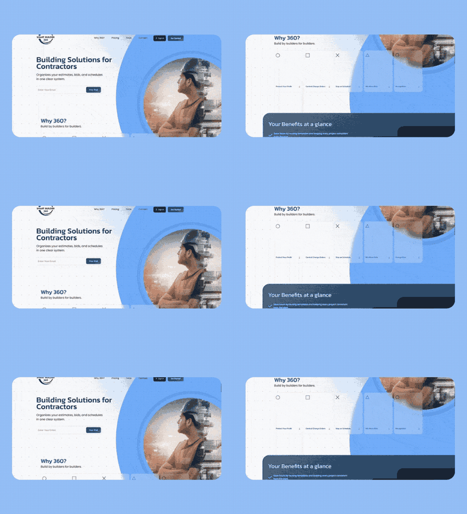
Smart Builder 360 brings estimates, specifications, bids, selections, change orders, bank draws, financial tracking and scheduling into one system for small residential builders.
The website had to translate a broad, interconnected application into plain language for contractors who do not have time for software jargon. Every page needed to answer three questions quickly: what does this solve, how does it fit the way builders work, and what should I do next?
This was not a single landing-page build. It became an evolving digital platform spanning core sales pages, ten product-feature pages, pricing logic, tutorials, lead generation, a searchable resource library, comparison content, technical SEO foundations and ongoing releases.
Minerva Visuals established the visual experience; Web25 translated it into a responsive, maintainable production system and expanded it across the full website.
We mapped every template, responsive breakpoint, shared navigation pattern, interaction, asset, conversion route and legacy dependency before changing the delivery model.
The site was moved into a self-contained codebase with page-level HTML, shared CSS, JavaScript behaviour, local assets, custom fonts and version-controlled deployment.
Navigation, calls to action, cards, accordions, feature patterns, pricing blocks, article layouts and footer content were standardised so a change could be rolled out safely across dozens of pages.
New product pages, animated interface mockups, resource filtering, pricing calculations, structured data and lead workflows were written directly in code instead of waiting on a page-builder workflow.
The website now evolves through tracked releases: new feature narratives, conversion experiments, mobile fixes, product updates, resource pages and technical improvements can ship continuously.
The final architecture connects broad product education with high-intent feature searches, pricing evaluation, training, support and a growing library of builder-focused resources.
The website does not merely list features. It connects each module to the financial, operational or communication problem a small builder recognises from the jobsite.
Monthly and annual plan cards calculate price from user count and the Digital Signatures add-on in real time, including updated annual savings.
Category chips, live title search, no-results messaging and query-string deep links let visitors explore builder resources without a page reload.
Contact and campaign forms validate inputs, provide accessible status feedback and pass qualified enquiries into an automated workflow.
Marketing pages connect cleanly to the external SaaS portal for sign-in and trial signup, while demo links move high-consideration buyers into a calendar flow.
Software, offer, article, breadcrumb and FAQ schema help search engines understand both the application and its supporting content.
FAQ accordions use lightweight browser-native behaviour, while labels, live regions, focus states and touch-specific styling improve usability.
Large static migrations can look finished on one screen while hiding serious failures elsewhere. We treated responsive quality as a systemwide engineering task, not a final visual check.
A stacking conflict placed the open mobile menu behind article content. The fix was tested and rolled out across every affected template.
Wide comparison tables had made entire pages scroll sideways. Each table was contained so navigation and page layout remained stable.
Desktop hover underlines could remain stuck after a mobile tap. Touch breakpoints now remove behaviour that does not belong on touchscreens.
Article title cards covered almost all of the photography on smaller screens. Responsive framing now preserves both context and readability.
Benefits cards required multiple passes to resolve clipping, spacing, ordering and arrow overlap in mobile landscape orientation.
Resource thumbnails drifting in Safari were corrected without changing layouts that were already stable in other browsers.
The production repository now contains nearly 50,000 lines of page markup, more than 15,000 lines of shared styling, 267 local media assets and 339 tracked project files. That scale is managed through version control and small, reviewable releases rather than opaque edits inside a page builder.
Across 196 tracked releases, the work has included page builds, product positioning, responsive fixes, pricing logic, resource discovery, lead automation, analytics, structured data, canonical cleanup, sitemap maintenance and ongoing content expansion.
SEO began in April 2026. The early Search Console view shows the new platform starting to earn consistent visibility while the content and technical programme continues.

Google Search Console · 1 April–29 August 2026
Next, we will document the one-year strategy, technical repairs, search-led page architecture, content system and the growth behind these numbers.
We turn complex platforms into clear customer journeys—and build the code, content system and release process required to keep them growing.
Discuss your SaaS project