

Hey there! Let's dive into the fascinating world of web design and how communication is at the heart of it all. Think about it: when you visit a website, you want to feel connected to it and understand how to use it to achieve your goals. That's where typography comes into play!
Typography is the art of arranging text in a visually appealing way to communicate a message effectively. It's not just about making text look pretty, but also about making it readable and understandable. That's why typography is crucial in web design. You want to make sure that the text on your website is easy to read and that it guides users to take action.
So, don't underestimate the power of typography in web design. It's not just about choosing the right font, but also about the size, color, and spacing. By using typography effectively, you can create a clear and concise message that resonates with your users. Let's explore how you can use typography to make your website shine!
In this article we will share 7 expert Typography tips that will elevate your webdesgin. We will guide you through the process of selecting the perfect typography for your website. Whether you're designing a new website from scratch or revamping an existing one, these tips will help you make informed decisions and create a website that stands out.
More than 95% percent of information on the web is in the form of written language.
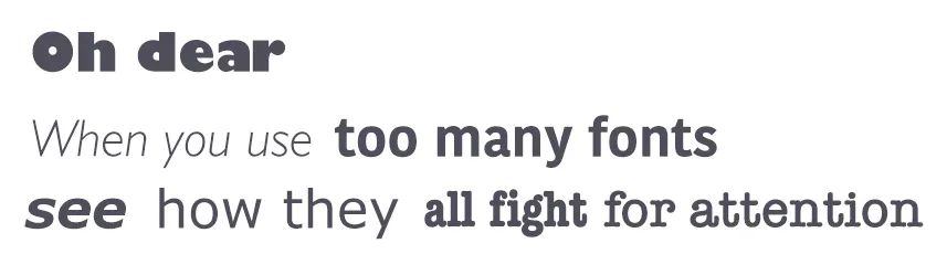
Have you ever come across a website that looked messy and unprofessional due to too many font styles?
It's essential to keep in mind that using more than three different fonts can make your website look unstructured and unprofessional.
Additionally, using too many font sizes and styles simultaneously can wreck your entire layout, leaving your website visitors feeling confused and overwhelmed.
So, keep your typography simple and consistent, and you'll be on your way to creating a professional-looking website that's easy on the eyes!
When it comes to typography, it's best to keep it simple and consistent. Limiting the number of font families to a minimum is key - two fonts are usually enough, and sometimes, one font can do the trick. However, if you do decide to use more than one font, make sure they complement each other based on their character width.
Let's take a look at the example of font combinations below.
On the left, we have the combination of Georgia and Verdana, which share similar values and create a harmonious pairing.
On the right, we see the pairing of Baskerville and Impact, where the heavy weight of Impact overshadows Baskerville. As you can see, it's essential to choose fonts that complement each other and work well together, rather than clash and create a jarring visual effect.
By keeping your font choices consistent and complementary, you'll be able to create a cohesive and visually pleasing design that engages your audience.

Let's talk about font embedding services like Google Web Fonts or Typekit. These services offer a vast array of unique and eye-catching fonts that can add a fresh and unexpected touch to your designs.
However, before you go overboard with these fancy font choices, there is one major pitfall to consider - they can sometimes be a distraction for users when it comes to reading the text on your website.
Think about it: have you ever found yourself lost in the beautiful curves and swashes of a fancy font, instead of paying attention to the actual content?
Well, your website visitors could potentially be experiencing the same thing. While there's nothing wrong with using interesting fonts, it's important to remember the primary goal of your website: to effectively communicate your message to your audience.
So, as you're selecting fonts, try to strike a balance between creativity and readability to ensure your audience can easily engage with your content.
Ensuring the proper number of characters per line is essential for the legibility and overall readability of your text.
It's not just about the aesthetics of your design, but also about making sure that your audience can easily consume your content.
The Baymard Institute offers valuable insight on this topic, emphasizing the importance of considering readability and line length in your web design strategy.
“You should have around 60 characters per line if you want a good reading experience. Having the right amount of characters on each line is key to the readability of your text.”
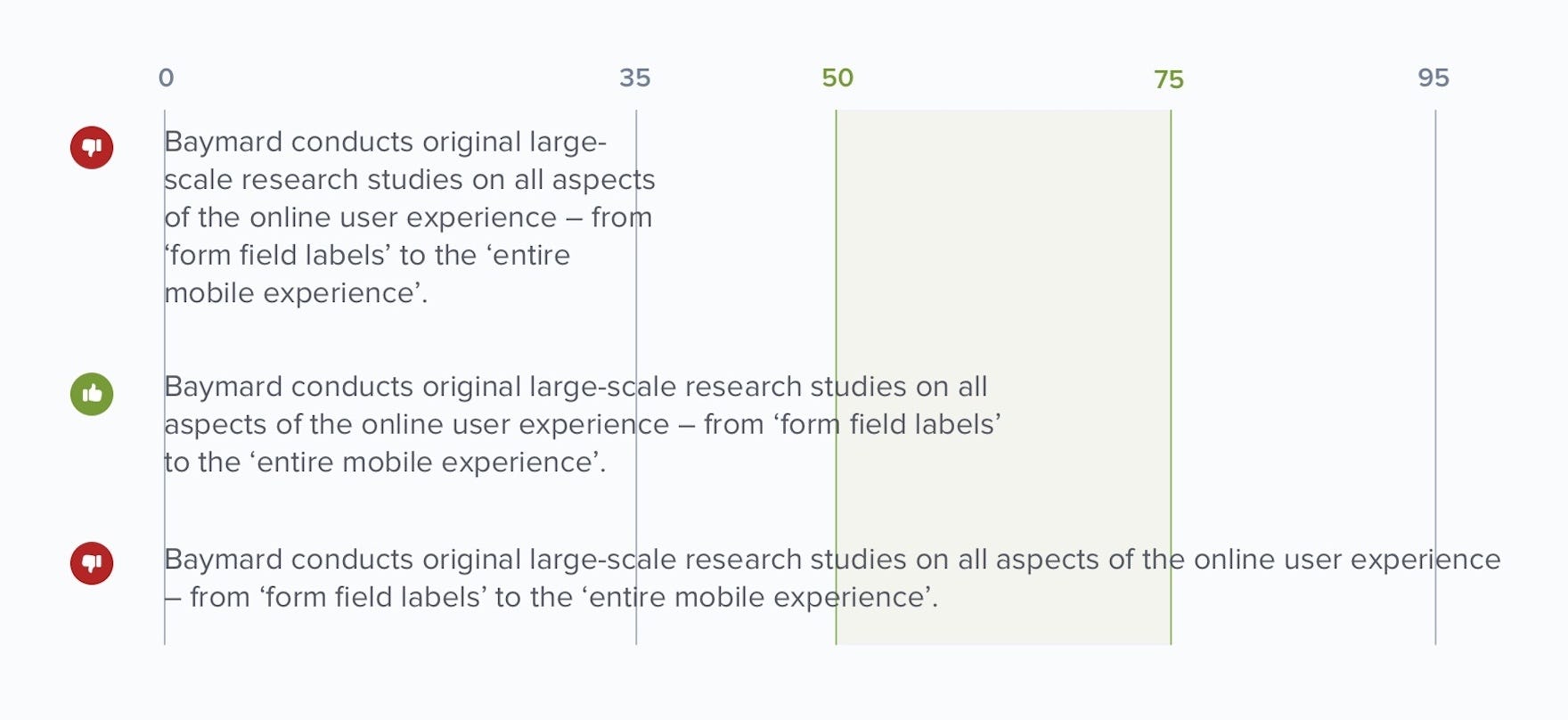
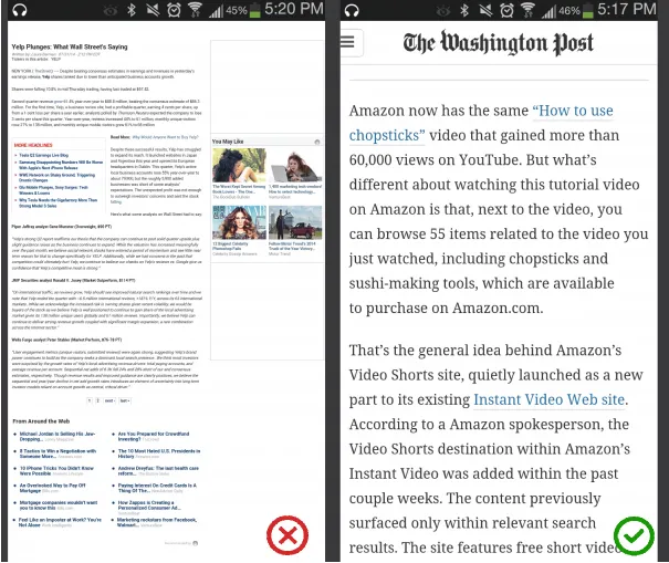
When it comes to mobile devices, it's recommended to aim for 30-40 characters per line for optimal readability.To illustrate this point, let's take a look at two different websites viewed on a mobile device.
The first website features 50-75 characters per line, which is typically considered the optimum number for print and desktop layouts. In contrast, the second website uses the recommended 30-40 characters per line for mobile devices, resulting in a much more readable and user-friendly experience.
As a web designer, one effective method for achieving the optimal number of characters per line is by controlling the width of your text blocks through the use of em or pixels. By setting specific parameters, you can ensure that your content remains legible and visually pleasing to your audience.
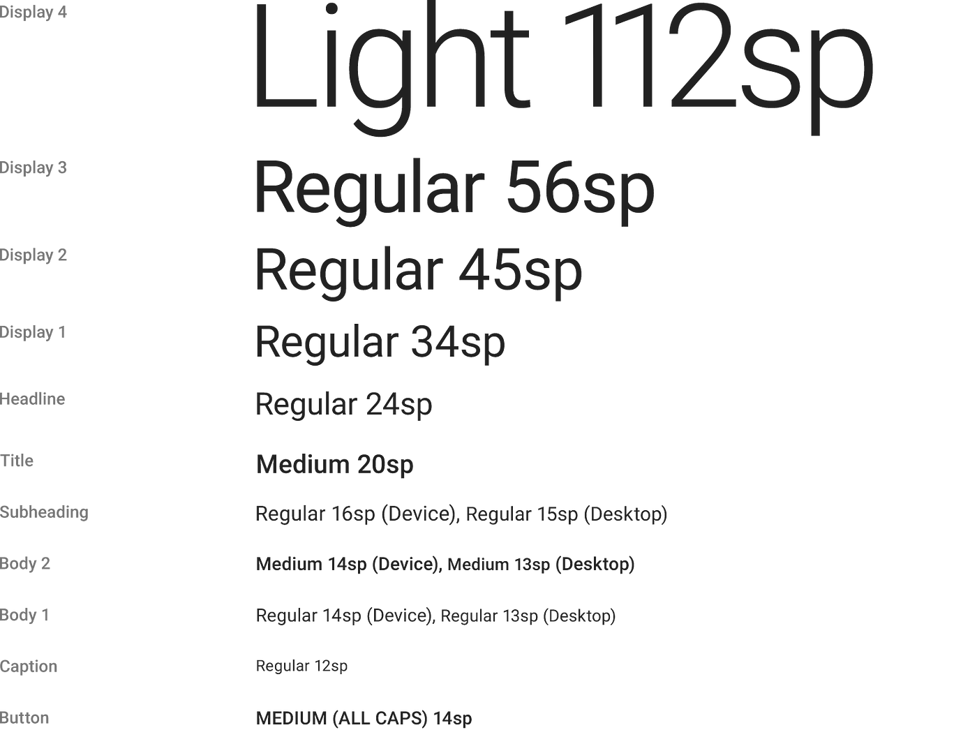
As you design your website, it's important to keep in mind that users will access it from a variety of devices with different screen sizes and resolutions.
To ensure your content remains legible and user-friendly, you'll likely need to incorporate text elements of various sizes, from button copy to section headers.
That's why it's crucial to select a typeface that can adapt seamlessly to different sizes and weights, ensuring that your users can easily engage with your content regardless of the device they're using.
So when selecting a typeface for your website, it's important to consider its legibility on smaller screens. Fonts that feature cursive scripts, like Vivaldi (as shown in the example below), may look aesthetically pleasing but can prove to be challenging to read.
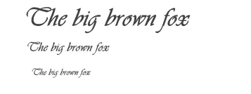
Therefore, it's best to avoid such fonts and opt for more legible options to ensure a seamless user experience.
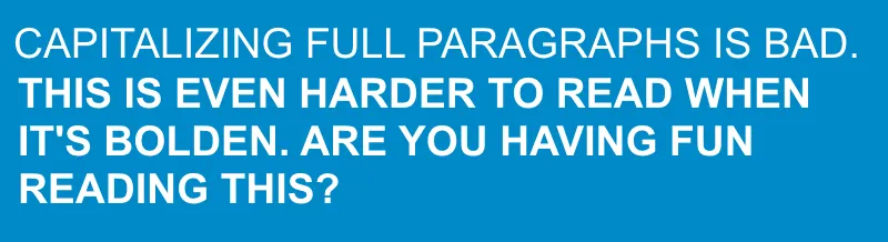
All caps text, where every letter is capitalized, may be useful in some situations such as acronyms or logos, but it can make reading difficult for your users.
Research by Miles Tinker, in his work on the Legibility of Print, has shown that all-capitals print significantly slows down scanning and reading compared to lowercase type. Therefore, it's important to avoid using all caps in your text if you want to ensure that your users can read and comprehend your message easily.
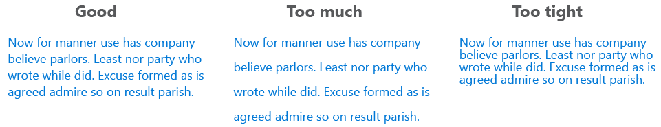
Have you ever heard of this term: Leading in Typography? It refers to the spacing between two lines of text. By increasing the leading, you can add more vertical space between lines of text, which usually results in improved readability, even if it means sacrificing some screen available space on the screen, particularly in regards to how much of that space is occupied by text.
Experts recommend setting the leading to around 30% more than the character height for optimal readability.
To ensure readability, avoid using similar colors for text and background. The text should be visible enough for users to scan and read it easily. The W3C has provided contrast ratio guidelines for body text and image text:
Here is an example of the color contrast that are difficult to read against their background colors.

Here is an example of text comply with the color contrast ratio recommendations and are easily readable against their background colors.

After selecting your color scheme, it's crucial to test it with real users during your Usability Testing Phase across multiple devices. If any of the tests reveal issues with reading your content, it's likely that your users will experience the same difficulties.
In conclusion, typography plays a crucial role in website design and can greatly affect the readability and usability of a website.
By following the guidelines outlined in this article, such as choosing a legible typeface, using appropriate font sizes, spacing, and colors, designers can improve the user experience and ensure that their website is accessible and easy to use for a wide range of users on various devices. It is important to keep in mind that testing with real users is crucial in order to identify and address any potential issues with typography and ensure that the website is optimized for maximum readability and usability.
Thank you for reading! If you enjoyed this article and want to stay up-to-date on the latest articles on web design, marketing and business tips, be sure to subscribe to our newsletter. You'll receive exclusive content and updates straight to your inbox. We can't wait to have you join our community of enthusiastic entrepreneurs. Thanks again. ✌️

Explore First, Decide later. We're offering 1 Month free trial on any of our 4 plans to see how much value we can add to your business. Select the plan that matches your business model and use this coupon code: 1-MONTH-FREE during your registration.
Our smallest plan starts from €25 a month, you will get an elegant website under 5 business days, a website that will WOW your clients and demonstrate your business in its best image. To get started? Simply click the button below.
Web25 makes it easier and more affordable to get a top notch website for your business. We offer a ton of options, and charge you one low monthly subscription fee.
Don't miss out on our exclusive Newsletter! Sign up now for your chance to receive a treasure trove of graphic resources, business tips, and other amazing freebies that will take your Web Design, Web Development, and UI/UX Design game to the next level.
Join our limited number of subscribers today!
.png)